


Overview
As food prices continue to rise, UIUC students are facing challenges finding quality food within their budget. Restaurants have weekly deals, but these are advertised in hard-to-find places. This results in missed food deals and specials, where students pay full price for most purchases.
We decided to tackle this problem by designing and implementing a calendar-based mobile app made exclusively for UIUC students to find daily food deals around campus.

Background
Today Only! was created as a semester project for a computer science course at the University of Illinois. We were simply asked to find a problem and design a digital product that works as a solution for it. First, we started by narrowing down our problem scope to issues that students face on the Illinois campus. Through browsing popular Reddit posts and reflecting on our own experiences, we discovered that one of the biggest struggles for UIUC students was finding affordable food on campus. To organize our findings, we created a research board.

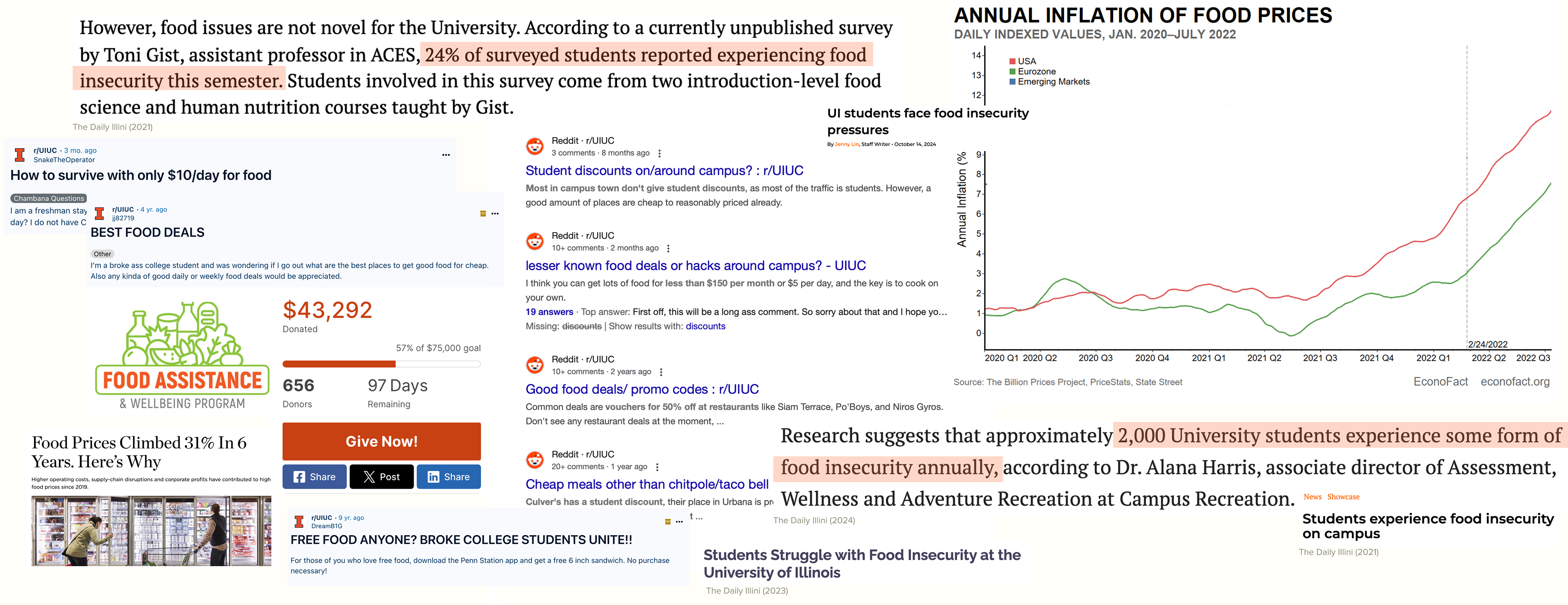
Research Board: Data from the school subreddit, school newspaper articles, food assistance programs

With a well-defined problem in mind, we then analyzed existing solutions to determine whether they fully addressed the issue or if there was a gap in the market. We found that existing options still made it difficult for students to find relevant food deals. Physical signs were only useful if students happened to pass by or enter a restaurant, while online searches required extra effort (such as having to search up individual restaurants) or often led to countless irrelevant deals—many of which were not tailored to college students or the UIUC campus, despite its 60,000 students and 40+ restaurants on Green Street.

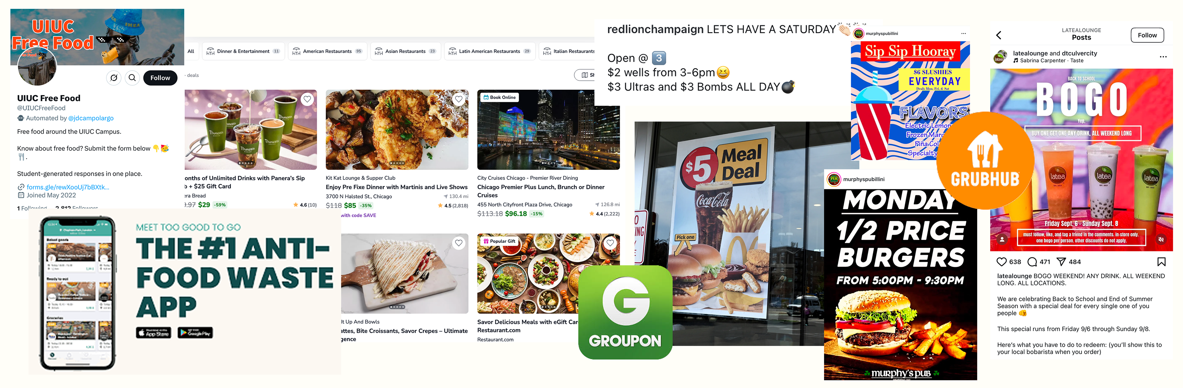
Some Existing Solutions: Too Good To Go, Instagram posts, Twitter pages, food delivery apps

Ideation & Prototyping
Our team began the design process by identifying key constraints. The app needed to be:
•Easy to implement by students
•Developed within a one-month timeframe
•All data had to be collected by us.
To keep the project manageable, we limited its scope to Campustown and structured it around a calendar-based system. Using the Google Calendar API allowed us to build the foundation quickly, which freed up time to refine the user experience and incorporate a few additional features. We chose to prioritize simple tasks navigating around the calendar frame, and focused on quick interactions and deal-spotting rather than developing a social or review platform.

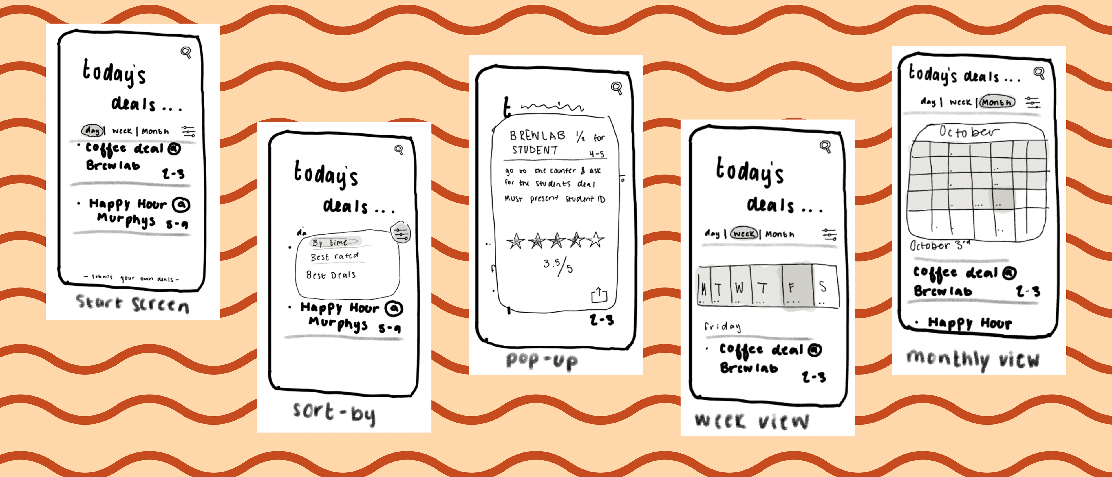
Rough idea of how the app would be formatted.

Once we had a clear idea of the app structure, we began to think about the specific cases where users would engage with the app. With those in mind, we then created a low-fi prototype of all of the expected screens, and their interactions.

Primary Use Case:
•Quick Access to Deals: UIUC students who need fast access to local food deals between classes or before events.
•Daily/Weekly Planning: Students can plan their meals for the day/week by checking current and upcoming deals.
Usage Frequency:
•Peak Times: Most engagement around lunch and dinner when students are looking for quick and cheap meal options.
•Short Sessions: Engagement occurs in brief sessions, with users spending a few minutes quickly finding relevant deals.
•Periodic Usage: Similar times every day/week.
•Peak Times: Most engagement around lunch and dinner when students are looking for quick and cheap meal options.
•Short Sessions: Engagement occurs in brief sessions, with users spending a few minutes quickly finding relevant deals.
•Periodic Usage: Similar times every day/week.
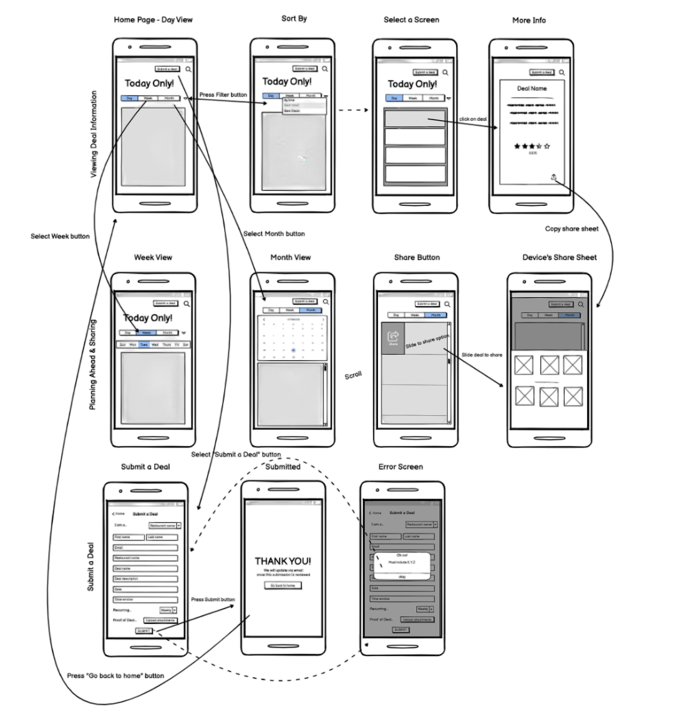
Balsamiq Prototype

Tasks & Personas
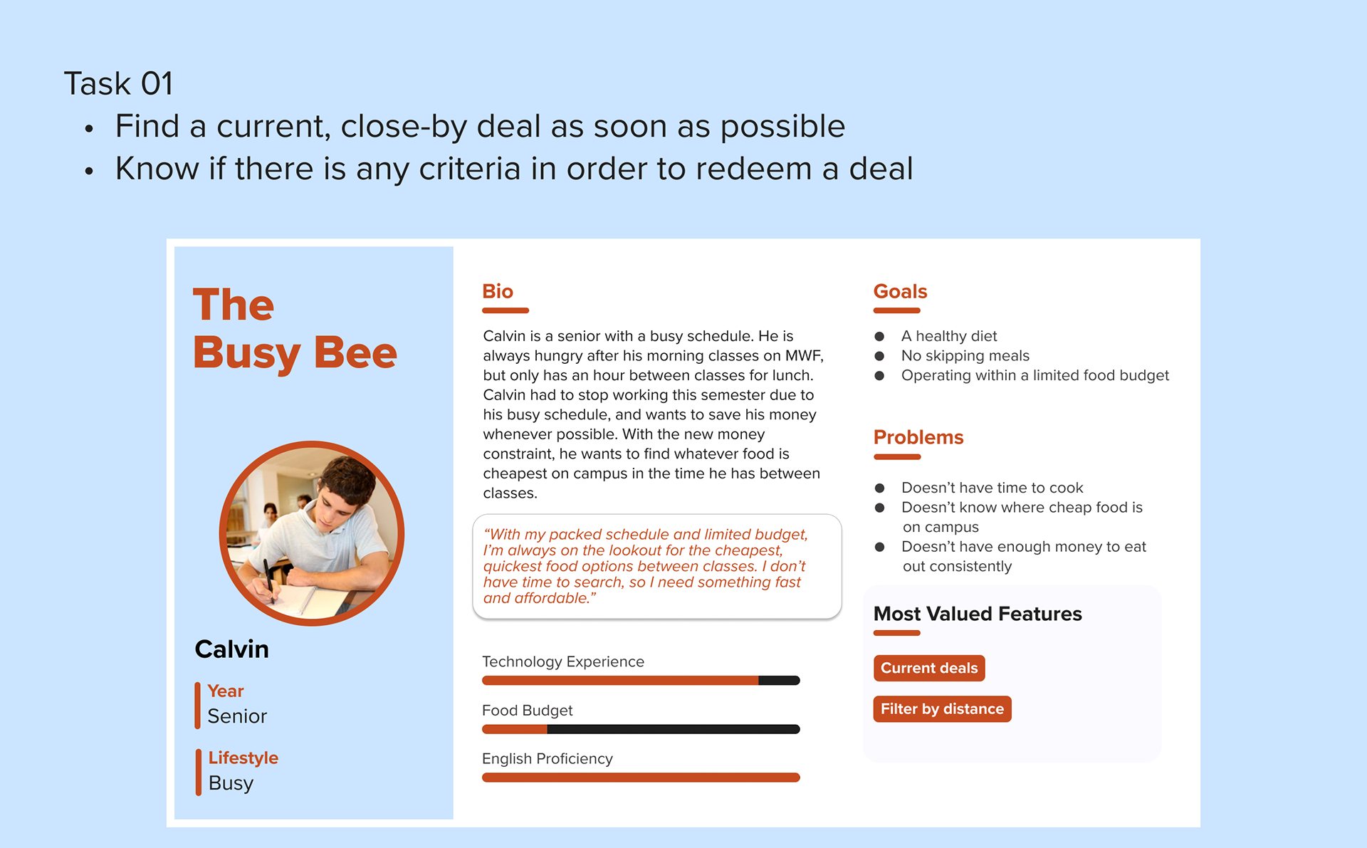
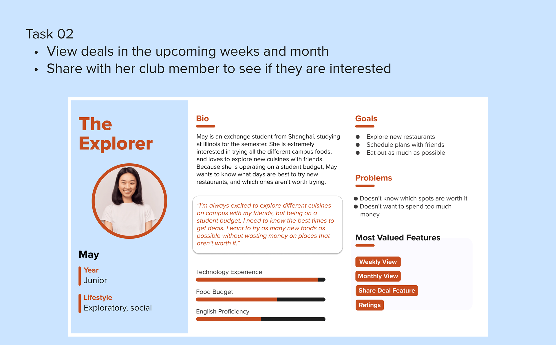
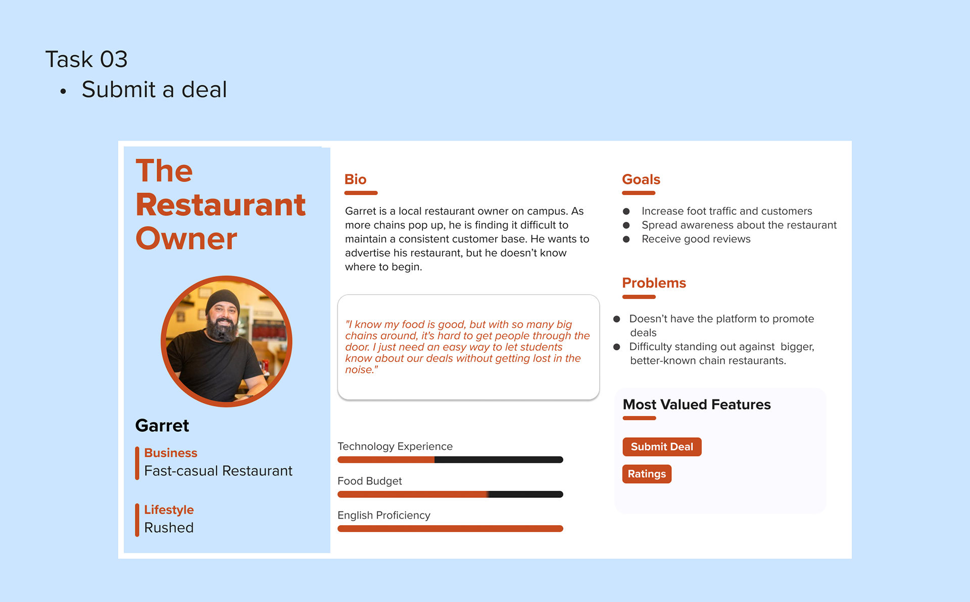
We conducted five user interviews to determine the needs of the users that would lead them to the app, and the factors that may deter users from engaging with the app. Using these results, we created three non-trivial tasks central to the app that corresponded with the main goals of the users. For each task, we created a persona who would be inclined to do that task, and a corresponding user flow.


Testing
Once personas were created, our team conducted three user testing sessions, one for each task. Each participant was given a brief description of the persona, and were instructed to complete the corresponding task on the prototype. Interviews were conducted using a contextual interview approach.
A separate click task was also distributed to seven different participants, asking them to filter by best rated, view specials for the following week, and submit a deal to the app. Through this research we determined strengths and pain points of the design.

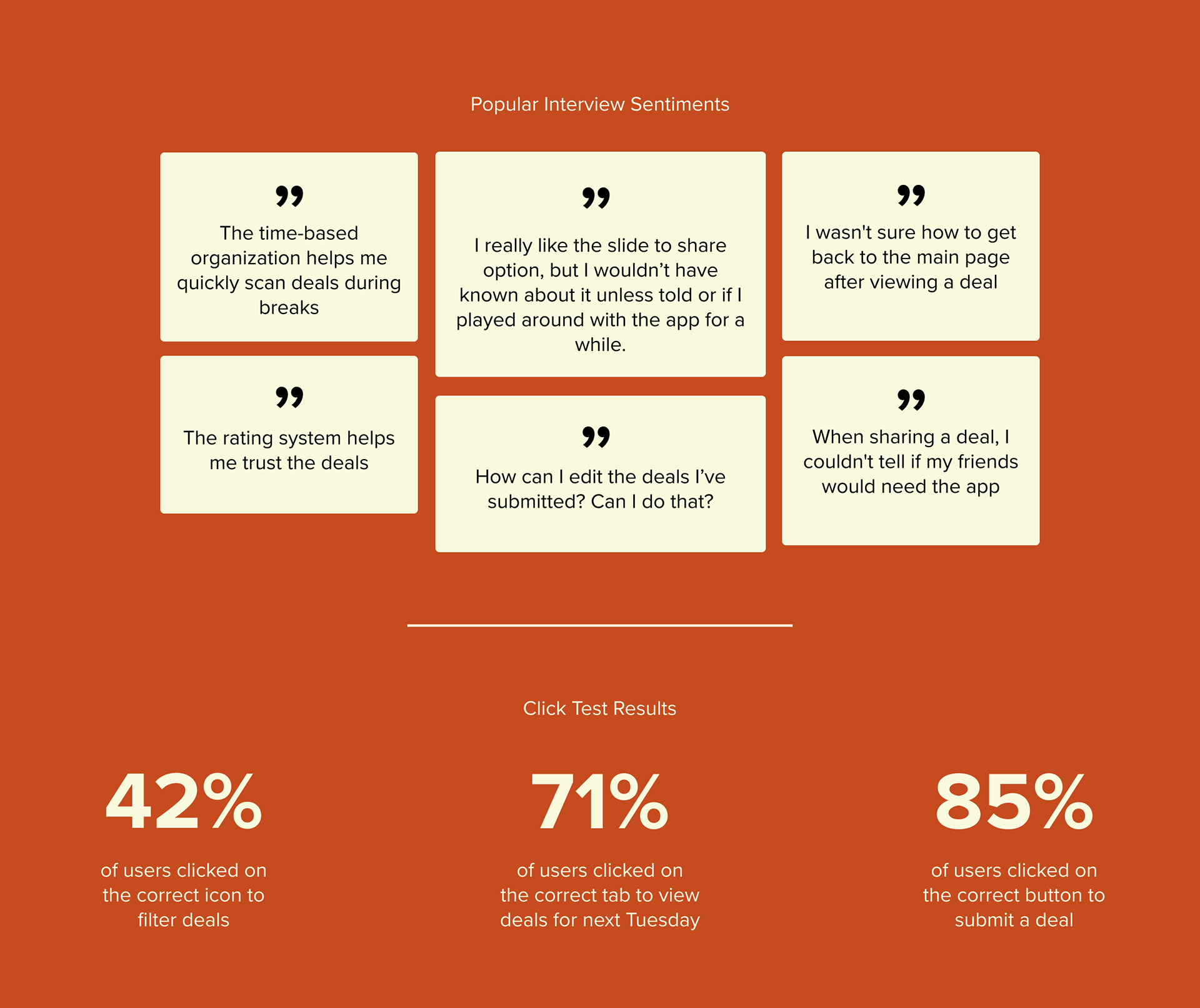

Key Themes in Research Findings
1. Management and editing ability over deals is important
2. Strong guidance and clarity for the deal submission process is needed
3. Prioritize simplicity and only include necessary features

Interface Design
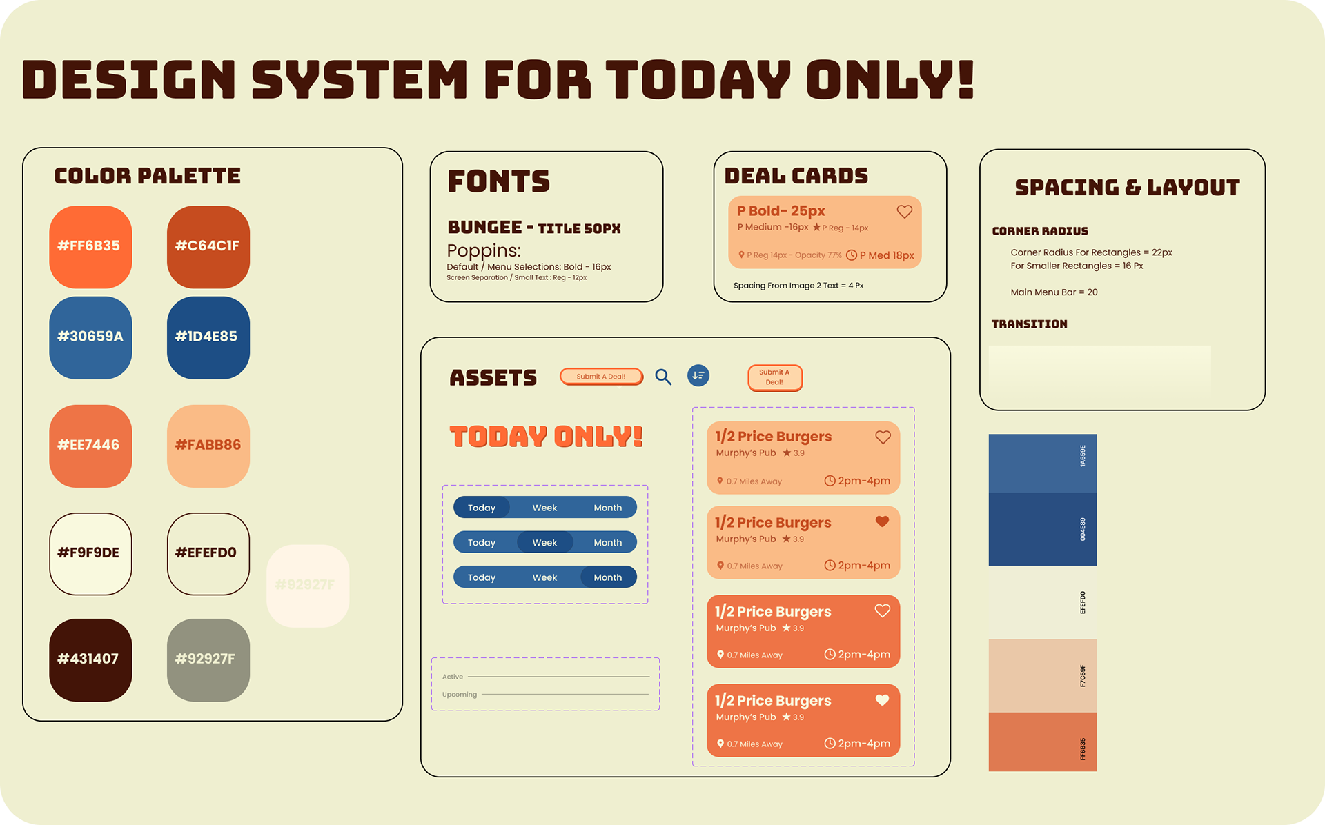
Our design uses a complementary color palette of the desaturated school colors. Muted oranges and blues relate to UIUC without looking like a university app. This unique color palette sets the app apart from typical deal advertisements.
A vibrant, fun design works well for our app's short-term interactions, enhancing retention by offering users an engaging experience.
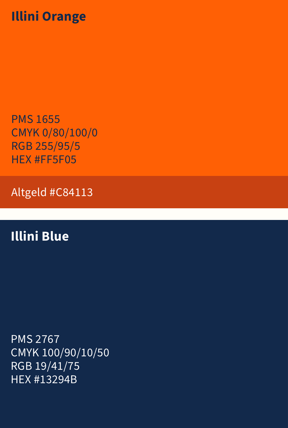
UIUC School Colors

Before creating hi-fi prototypes, we sent out a survey to 20 participants asking what information about a deal they value most.
The data showed that 70-80% of users care most about the distance from the restaurant, the deal's time window, and the restaurants/deals ratings. The deal card was designed to reflect that.


Then, we created high-fidelity prototypes in Figma to use as reference for the implementation stage.

Key Screens
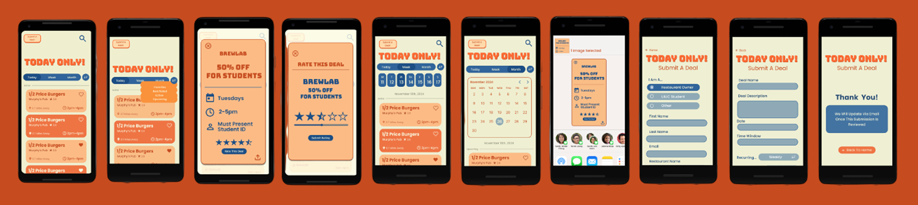
All Screens

Implementation
This app was fully implemented on Android Studio. For a full walkthrough, please check out the following video.
Tools Used:
To find restaurants & deals: Google Places API, Yelp API, Personally finding deals on campus from advertisements, friends
For calendar implementation: React-native calendars, Google Calendars API
A Closer Look
Throughout the process, we determined three key tasks based on the users needs and goals of the app. The following user flows depict what we found to be the three most likely interactions with the app.
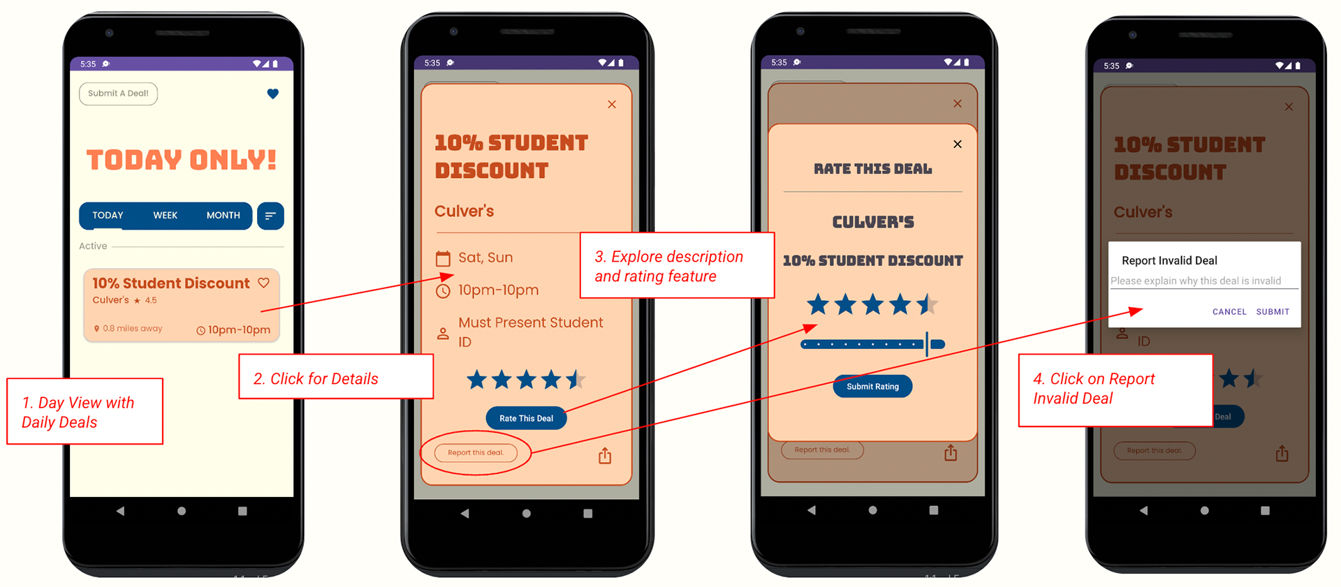
Task 01: Daily Deals
Key Features: Day View, Deal Details, Sort By, Rate Deal, Report Deal
Task Feedback: Click for more deal information, Responsive stars adjust dynamically, Report a deal confirmation screen, Rating confirmation screen.
Task Feedback: Click for more deal information, Responsive stars adjust dynamically, Report a deal confirmation screen, Rating confirmation screen.
Task 02: Plan Ahead
Key Features: Week View, Share Deal
Task Feedback: Buttons displaying day of week and date, Image preview confirms the deal can be shared without the recipient needing the app.
Task Feedback: Buttons displaying day of week and date, Image preview confirms the deal can be shared without the recipient needing the app.

Task 03: Submit a Deal
Key Features: Deal Submission Form, Submission Screen
Task Feedback: “Thank you” screen, Error prevention for invalid or missing fields, Clear input instructions
Task Feedback: “Thank you” screen, Error prevention for invalid or missing fields, Clear input instructions
